1.使用
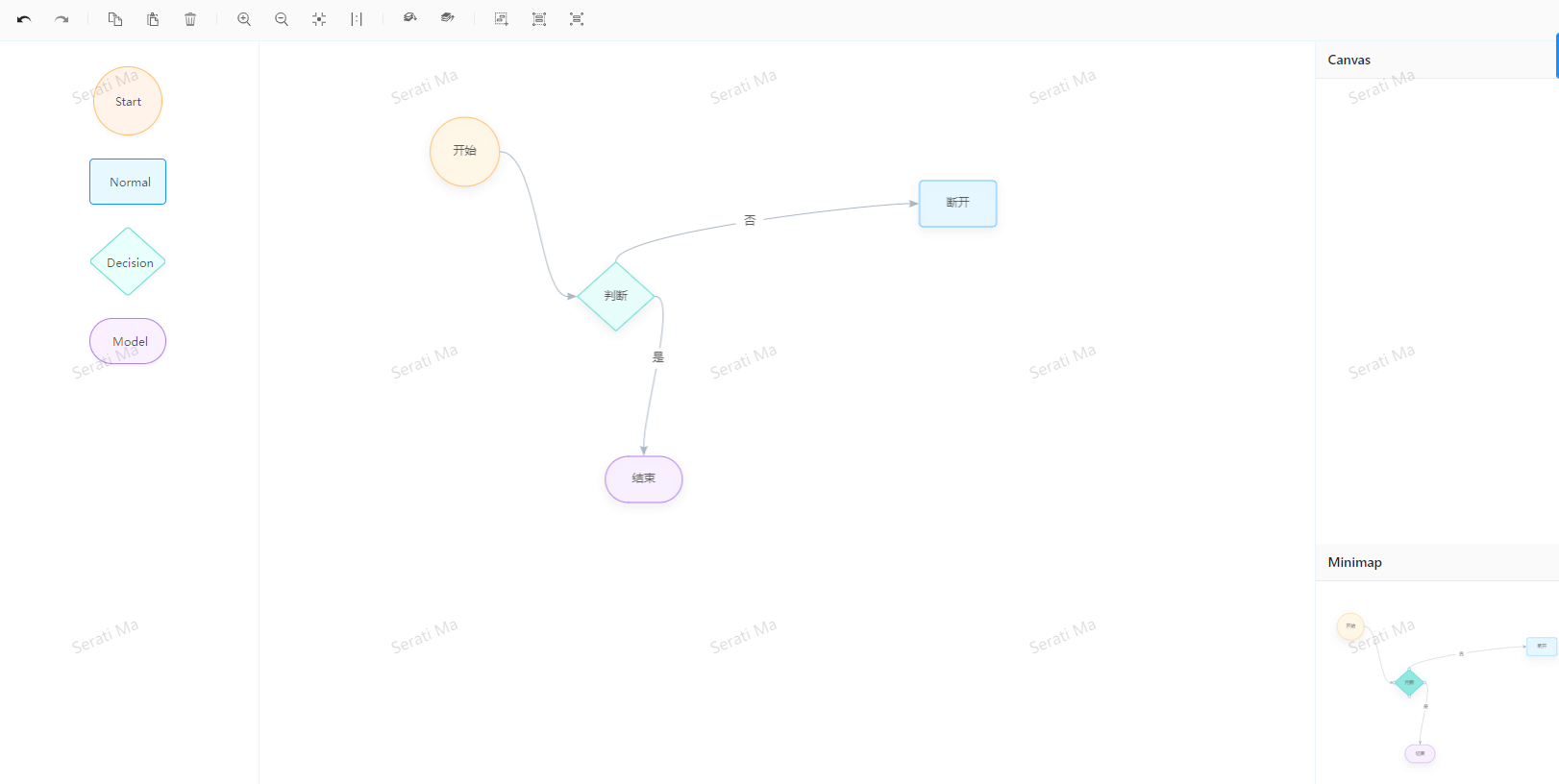
通过使用antd-pro封装好的流程编辑器修改,如图:
![图片[1]-流程编辑器-柳杉前端](https://liush.top/wp-content/uploads/2022/06/OH_9EZYO9I_VN0F8ISTJ-1024x515.png)
2.自定义节点和边
2.1自定义边
注意:这里需要graph属性注册边形状,不然无法自定义,如下面代码,属性参考文档
        <Col span={16} className={styles.editorContent}>
          <Flow className={styles.flow} graph={{
            edgeDefaultShape: 'custom-edge',
          }}/>
          <CustomEdge/>
          <CustomNode/>
        </Col>
import React from "react";
import { RegisterEdge} from "gg-editor";
class CustomEdge extends React.Component {
render() {
const config = {
getStyle(item) {
const model = item.getModel();
const { color, size } = model;
return {
stroke: color || "#A3B1BF",
lineWidth: size
};
},
getAnchorStyle() {
return {
stroke: '#ff0'
}
}
};
return (
<RegisterEdge name="custom-edge" config={config} extend={"flow-smooth"} />
);
}
}
export default CustomEdge;
2.2自定义边的箭头
    const config = {
      getStyle(item) {
        const model = item.getModel();
        const {color, size} = model;

        return {
          startArrow: false,
          endArrow: true, // 结束箭头是否显示
        };
      },
      endArrow: {
        // 箭头路径
        path(item) {
          const keyShape = item.getKeyShape();
          let lineWidth = keyShape.attr('lineWidth');
          lineWidth = lineWidth > MIN_ARROW_SIZE ? lineWidth : MIN_ARROW_SIZE;
          const width = lineWidth * 10 / 3;
          const halfHeight = lineWidth * 4 / 3;
          const radius = lineWidth * 4;
          return [
            [ 'M', -width, halfHeight ],
            [ 'L', 0, 0 ],
            [ 'L', -width, -halfHeight ],
            [ 'A', radius, radius, 0, 0, 1, -width, halfHeight ],
            [ 'Z' ]
          ];
        },
        shorten(item) {
          const keyShape = item.getKeyShape();
          const lineWidth = keyShape.attr('lineWidth');
          return (lineWidth > MIN_ARROW_SIZE ? lineWidth : MIN_ARROW_SIZE) * 3.1;
        },
        style(item) {
          const keyShape = item.getKeyShape();
          const { strokeOpacity, stroke } = keyShape.attr();
          return {
            fillOpacity: strokeOpacity,
            fill: '#0099CC'  // 箭头颜色
          };
        }
      }
    };
2.3自定义节点
import React from "react";
import { RegisterNode } from "gg-editor";

class CustomNode extends React.Component {
  render() {
    const config = {
      draw(item) {
        const keyShape = this.drawKeyShape(item);
        // 绘制图标
        const group = item.getGraphicGroup();

        group.addShape("text", {
          attrs: {
            x: -15,
            y: -25,
            width: 30,
            height: 30,
          }
        });

        // 绘制标签
        this.drawLabel(item);

        return keyShape;
      },
      anchor: [
        // [0.5,1],
        // [0, 0.5],
        // [0.5, 0],
        // [1,0.5],
        // 上边中点
      ]
    };

    return (
      <RegisterNode name="dispatch-node" config={config} extend={"flow-capsule"}  />
    );
  }
}

export default CustomNode;
3.问题汇总
3.1无法注册边的问题?
就是注册的边没有先自定义,查看如上自定义边可以解决
3.2箭头无法显示的问题?
就是注册边时候没有启动箭头显示
4.相关组件推荐
4.1ggEditor(v2)
介绍:基于 G6 和 React 的可视化图编辑器,不推荐使用 ,因为很久未维护,推荐x6或者 G6
有关文档:
https://www.yuque.com/blueju/gg-editor/ueldgh
https://www.yuque.com/antv/g6/custom-edge(记得查看v2版本)
4.2Butterfly
地址:Butterfly
介绍:一个基于JS的数据驱动的节点式编排组件库
© 版权声明
文章版权归作者所有,未经允许请勿转载。
THE END


暂无评论内容